LOW HI PROTOTYPING WAS THE MOST EFFECTIVE WAY TO GAIN MEANINGFUL FEEDBACK.
Each feature phase involved cycles of requirements, consensus, approvals, detailed specifications, and handoffs.
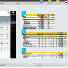
The process started with sketching and whiteboarding concepts and flows alongside UX, IA, and accessibility partners before translating them into high-fidelity design comps. Given the reliance on existing design patterns, transitioning directly into high-fidelity designs was straightforward.
Next, the comps were sliced and assembled into a prototype tool. Early stages focused on high-risk areas of the design, while later phases refined micro-interactions, developed in Axure.
Prototyping efficiently gathered valuable feedback from the team, secured stakeholder consensus, and gained senior leadership approval. These prototypes were easily distributed as videos and repurposed for usability testing.
5
Workshops
66
Wireframes
9
Prototypes